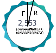
Recently, I am working on a music platform project where users can upload and share tracks with others. In the dashboard page, we will visualize the data associated with uploaded tracks. Maybe our designer was bored with regular pie charts, she designed a star-shaped chart which I was so amazed at. Here is a screenshot of the design:

At the very beginning, I was thinking of using plugins like Highcharts to get the work done. However, after I realized there was no quick method for our customized chart, I had better work on it in my own way using canvas though my knowlege of canvas was very limited at that time.
Draw Outline
The first step is to draw the outline of this star shape. I observed the shape for a while and finally knew how to draw this shape with some middle-school knowledge of Trigonometric Functions. We can see the whole star shape is sliced equally into 28 parts. To make things easier, let’s make the center of the canvas area the center of our chart. For example, if the canvas element has a width of canvasWidth and a height of canvasHeight, the coordinates of the chart center is (canvasWidth/2, canvasHeight/2). The start point of the chart is at the top center.

Here is my javascript snippet to draw the chart outline:
var canvas = document.getElementById('canvas');
var canvasWidth = canvas.width;
var canvasHeight = canvas.height;
var ctx = canvas.getContext('2d');
// start to draw outline
var R = 90;
var r = 78;
ctx.beginPath():
ctx.moveTo(1/2 * canvasWidth, 1/2 * canvasHeight - r); // the start point
	for(var i = 1; i <= 28; i++) {
	  if (i%2 == 1) {
	    ctx.lineTo(1/2 * canvasWidth + Math.sin(1/14*Math.PI*i)*R, 1/2 * canvasHeight - Math.cos(1/14*Math.PI*i)*R)
	  } else {
	    ctx.lineTo(1/2 * canvasWidth + Math.sin(1/14*Math.PI*i)*r, 1/2 * canvasHeight - Math.cos(1/14*Math.PI*i)*r)
	  }
	}
	ctx.lineWidth = '2';
	ctx.strokeStyle = '#fff';
	ctx.stroke();
Now the chart looks like below:

I will talk about how to paint colors next time in another post.